 I’ve always been a big fan of the conceptual use of negative space in design. Michael Vanderbly’s logo for the California Conservation Center, pictured here to the right, being one of my all-time favorite applications of this design technique. And as witnessed by the number of rip-offs of this that exist, I’m not the only fan of this design slight of hand.
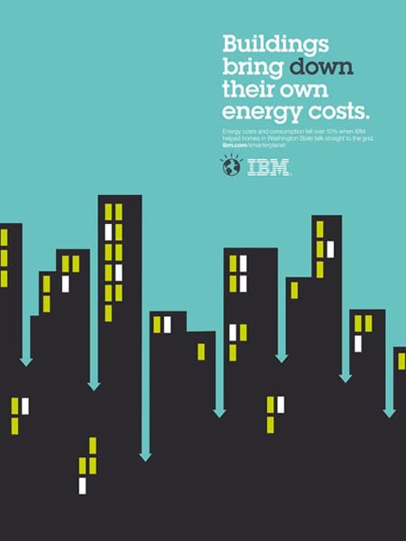
 I was recently in the Delta terminal at the Reagan National Airport, enjoying a hot cup of coffee with my wife Lynne and patiently waiting to board our flight back to Boston, when I noticed that the food court was surrounded by a series of posters for the IBM Smarter Planet campaign. Created by Ogilvy Paris, each poster consists of a simple headline set in a slab serif font (Lubalin Graph) with a supporting illustration rendered in a bold and simple graphical style. Each image incorporates a creative and beautifully conceived use of negative space which when combined with the headline creates a smart and memorable poster. What a treat it was to be corralled by this wonderfully executed campaign.
Follow the link below to see a number of these stunning posters and kudos to the designers, writers, and illustrators involved in this project. -PK
