 As a kid growing up in Cincinnati, I was a cowboy wanna-be and spent many an afternoon looking at books about the West, dreaming of six-shooters and lassos, and envisioning myself in the cavalry uniform displayed in the back pages of the Sears catalog.
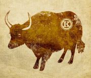
One of the books I remember best was on cattle ranchers and the brand marks they burned into the hindquarters of their herds. There was the Double-R brand, the Lazy-E and Rocking M – I can’t remember them all, but I realize now that it was the first logo book I ever saw.
I was drawn to the simplicity of those designs and their importance. Those symbols were serious business. Get caught on a horse with somebody else’s brand and you could get a belly full of lead!
I wonder about the designers of those marks. What kind of thought (market research? focus groups?) engendered designs burned into the hide of a horse’s ass? Did they ever discover that the selected brand looked just like that of another ranch two days west? Any swooshes? Did the designers wear black? Did they sport goatees?
While no one will ever mistake me for a cowboy, I believe in some way I carry on the aim of those cowboy branders. I’m a hired gun creating distinctive images that communicate the quality and pride of an organization, images that influence the course of a business through visual communication. Without the use of ropes and hot irons.
Those old cowboys would probably get a chuckle out of how far their humble design trade has evolved. From corporate identities to Web site design to sales and marketing collateral – we still call it branding.
-PK
Originally published in the AIGA Journal, circa 2006