Categories
Branding Community Design

Kroner brands Breakthrough Cambridge’s 20th Gala

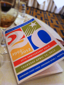
BTGB 20th GalaFor the second year in a row, Kroner Design has had the pleasure of working with Breakthrough Cambridge (now Breakthrough Greater Boston), the only year-round, tuition-free academic program in Cambridge, to brand their annual Gala fundraising event. This year’s event was special, as it marked their 20th year anniversary and the public announcement of the expansion of their mission into Boston.

The goals for the gala were to attract 300 guest and raise $300k, and to do so within a very tight budget, and an even tighter space to work with. At the end of the night, there were over 450 people in attendance, including a a guest appearance by Sen. John Kerry of Massachusetts, who delivered a moving off-the-cuff speech endorsing the Breakthrough program with a global perspective. It was a truly memorable and moving night.
Categories
Design Fine Arts Photography

“Painting Air” by Spencer Finch

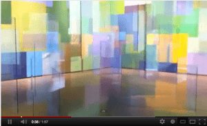
“Painting Air”, by Spencer Finch: Click to see video

I recently saw an installation at the RISD Museum of Art entitled “Painting Air” by Spencer Finch and was mesmerized.

Finch was inspired by his visit to the water gardens created by Claude Monet at his home and studio in Giverny, France. Finch was struck by how the water was always in flux as a result of shifting air currents and conditions of light.

Walking along the perimeter of the room, visitors can see through the dozens of suspended glass panels to the overlapping squares of colors, inspired by the color palette of  Monet,  painted on the walls along the perimeter of the installation beyond the glass. The air currents created by your movement through the exhibit gently rotate the glass panels causing them to sometimes reflect the colors throughout the room. The effect is both ethereal and sublime. Wow!

Categories
Branding Design

Brand Bonanza

toilet paperI googled “branding” today and came up with over 143 million hits in less than a second! Seems as though everybody and their uncle either does branding or is being branded nowadays. Heck, even my hometown of Cheviot, Ohio recently looked into a rebranding effort. Who would of thunk they even had a brand to begin with?

The use of the word branding has certainly changed since I entered the design profession in the early 80s. Then “branding” was associated with products like toothpaste, laundry detergent, or toilet paper. Now everyone has a brand, and a company’s brand is so important that it is recognized on the ledger sheets of most Fortune 500 companies. The financial value of Coca Cola brand, for example, is +$71 billion; Google itself is at +$55 billion, which is up $43 billion from 2006.*

Categories
Branding Design

Thoughts on Branding

As a kid growing up in Cincinnati, I was a cowboy wanna-be and spent many an afternoon looking at books about the West, dreaming of six-shooters and lassos, and envisioning myself in the cavalry uniform displayed in the back pages of the Sears catalog.

One of the books I remember best was on cattle ranchers and the brand marks they burned into the hindquarters of their herds. There was the Double-R brand, the Lazy-E and Rocking M – I can’t remember them all, but I realize now that it was the first logo book I ever saw.

I was drawn to the simplicity of those designs and their importance. Those symbols were serious business. Get caught on a horse with somebody else’s brand and you could get a belly full of lead!

Categories
Branding Design Illustration

Positively Negative: Part 1

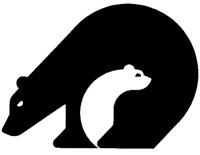
California Conservation Corps logoI’ve always been a big fan of the conceptual use of negative space in design. Michael Vanderbly’s logo for the California Conservation Center, pictured here to the right, being one of my all-time favorite applications of this design technique. And as witnessed by the number of rip-offs of this that exist, I’m not the only fan of this design slight of hand.

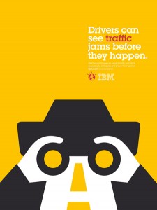
IBM Smarter Planet PosterI was recently in the Delta terminal at the Reagan National Airport, enjoying a hot cup of coffee with my wife Lynne and patiently waiting to board our flight back to Boston, when I noticed that the food court was surrounded by a series of posters for the IBM Smarter Planet campaign. Created by Ogilvy Paris, each poster consists of a simple headline set in a slab serif font (Lubalin Graph) with a supporting illustration rendered in a bold and simple graphical style. Each image incorporates a creative and beautifully conceived use of negative space which when combined with the headline creates a smart and memorable poster. What a treat it was to be corralled by this wonderfully executed campaign.

Follow the link below to see a number of these stunning posters and kudos to the designers, writers, and illustrators involved in this project. -PK

Follow

Get every new post delivered to your Inbox

Join other followers: