As a visual communications designer and artist I am interested in the relationship between design and fine arts.
On a recent trip to Italy to study painting and sculpture, I was struck by how much the frescos of the 13th century painter Piero della Francesca and the paintings of Caravaggio relate to the work I do as a designer of marketing communications. I know you’re thinking “too much vino rosso for Paulo,” but hear me out.
These guys were hired guns, charged with communicating (non-verbally I might add) the content of some well-heeled and very influential clients (the Catholic church) who had a specific story to tell about their product (Catholicism) to their target markets (church-going folks). And to do so in some really large spaces, and at times, difficult working conditions.
I admire their work for many reasons, one of which is the strength of the design.
Analysis of a Painting
As a designer trained in a Bauhaus influenced design school (University of Cincinnati), I have always been somewhat of a grid nerd, and love to find the underlying structure of artwork when I go to a museum or an art gallery.
On a recent trip to the MFA here in Boston, I came across one of my favorite paintings, “Pilgrimage in the Roman Campagna” by the 18th century Belgian painter Francois Joseph Navez. This time I took a photo of it so I could analyze its composition and structure.
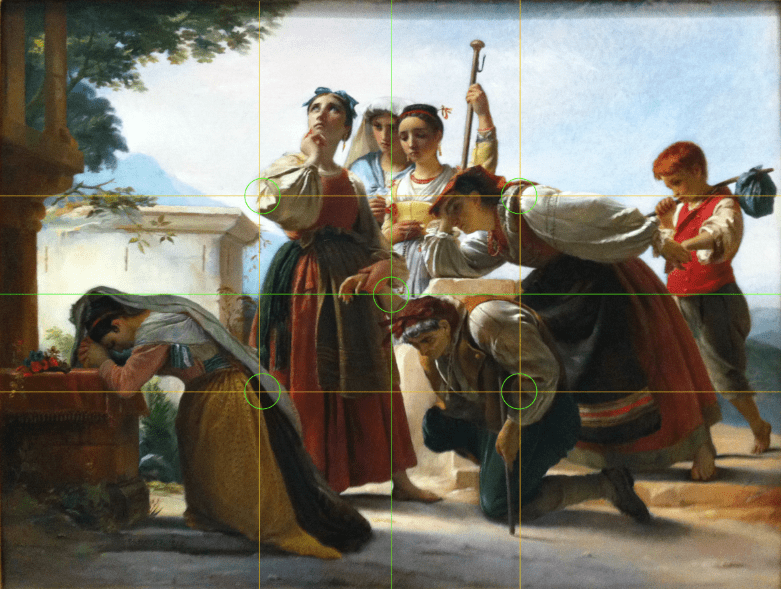
One of the first things I like to do when looking at a painting, whether it is abstract or representational, is to locate the basic grid structure in relationship to the overall proportion of the canvas. Figure 1 illustrates the basic grid structure by dividing this canvas in half and thirds. As usual, this reveals some immediate information regarding the construction of the painting.

Right off the bat you can see that Francois has placed key points of tension on each of these grid lines, notably the elbow of the heroine, the juncture of the hands in the middle of the image, the shoulder of the woman leaning on her elbow and the line of the cane of the man in the front. All of these, and others, anchor the composition in relationship to the overall proportion of the canvas.

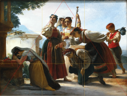
In Figure 2 you can see how he has used a triangular motif in the entire composition, which unifies the foreground and primary characters in this scene, gives the composition a triangular flow, and activates the entire canvas.
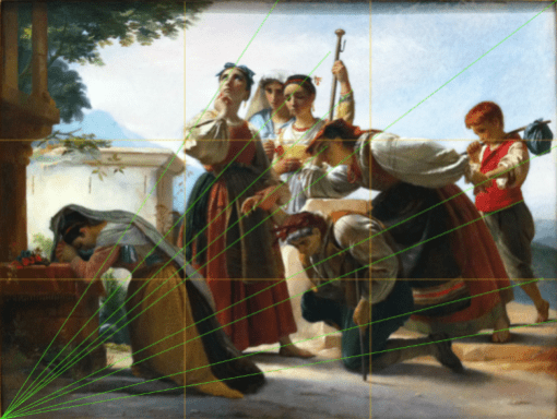
But where it get interesting for me is how Francois has used the diagonal counter flow emanating from the lower right and lower left corners to give this painting so much movement while at the same time maintaining a sense of balance and serenity.

Figure 3 shows the diagonal thrust from the lower right upward to the upper left corner. Every point on the canvas is considered in relationship to each other, creating an interconnectedness among all the characters and the canvas. But all this movement from right to left wouldn’t work if it wasn’t countered by an equal and opposite movement from left to right.

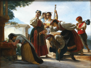
In Figure 4 we see this counter movement, which again skillfully creates a series of relationships that enhances the original triangular thrust of the image. And this only gets to the structure of the painting. I think the use of color in this piece is just as effective as the underlying grid in moving your eye around the canvas, and keeping you actively involved in the story Francois was charged with communicating to us.
So what’s this got to do with web design?
For me, these compositional and visual techniques are at the core of every design I work on, whether it is a web site or printed brochure. I don’t necessarily start with the grid, but it’s there as a tool to help guide the relationship of the various elements on the page—text and graphics—and provide the structure that helps guide the viewer in a thoughtful and logical direction. In a sense, that is our job as designers and artists: to act as a tour guide for the eye. -PK
